Dupe Cherries App
OBJECTIVE
To create a mobile app that provides users with cheaper alternatives to their favorite expensive brands or articles of clothing.
OVERVIEW
COURSE: HCDE 318: User-Centered Design
TEAM: Kenny P., William P.
TIMELINE: 10 Weeks, Fall 2022
TOOLS: Figma, Miro
PROBLEM CONTEXT
Clothing articles are an expression of an individual’s personality, but price often prevents people from expressing their true selves. There are clear distinctions in price between low-end and high-end brands that act as barriers to purchase. As a result, someone looking for a certain style within their budget typically has to spend an incredible amount of time searching across multiple sites and catalogs.
Dupe Cherries is an app designed to help shoppers find budget-friendly alternatives to clothing and accessories. Users can submit a photo of an item or search by brand name to discover similar products either locally or online, based on their preferences. The app also allows users to set price ranges, specify clothing features like color and size, read reviews from other users, and create communities. By offering affordable alternatives, Dupe Cherries empowers users to make informed purchases and wear what they love without breaking the bank.
PRODUCT
PROCESS
RESEARCH
We first conducted research on our target users and also for competitors to our application in the market. This led to us creating our personas to act as an audience to form the creation of our application around and competitive analysis to determine what has been done and what can be done to innovate in the clothing dupe market. Additionally, we created our user journeys based off of our intended use in combination of our personas.
FINDINGS:
We each conducted semi-structured interviews with three individuals who had an interest in fashion. We determined that our general target audience starting out would be anyone who has an interest in fashion or buys cloths, no matter the subjective scale of that interest. From our user interviews, we determined that our users:
Want easier ways to filter out and save money on styles they have in mind
Have preferred brands they form their purchasing decisions around
Utilize both in-person and online shopping avenues
Full notes can be found in our user interview documents here.
PERSONAS:
We consolidated our findings into two personas. These personas are based off our users' preferences from our user interviews and are key players in emulating how our target users would interact with our application. In the process of consolidating our findings into personas, we began with provisional personas which allowed us to efficiently write down general ideas before going into detail in our refined personas. Categories we focused on for to build out our personas were: characteristics, use/tech, goals, pains, desires, and writing out a scenario most relevant to their preferences.
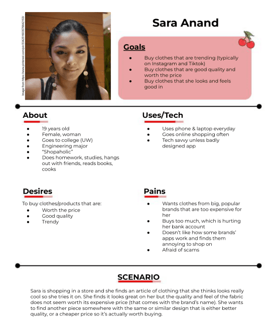
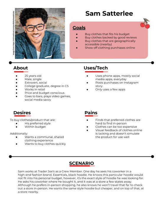
COMPETITOR ANALYSES:
Our group proceeded to perform competitive analysis to determine how we could innovate based off the existing dupe market. We evaluated thredUP and Zulily, both of which are platforms that allow the user to find cheaper deals on clothing. However, through our market analysis we determined that there are no direct competitors to the Dupe Cherries app. There are options to find similar clothing through reverse image search applications such as Google Reverse Image Search and TinEye, however, these work to find the exact same clothing rather than similar options. Overall, we found that our mission aligns with both thredUP and Zulily, however, the largest difference is that their users are required to manually search through a large category through various filter options to find duplicate items while our app's leading function is being able to take a picture and the app finding it for you.
Read our detailed competitor analyses here.
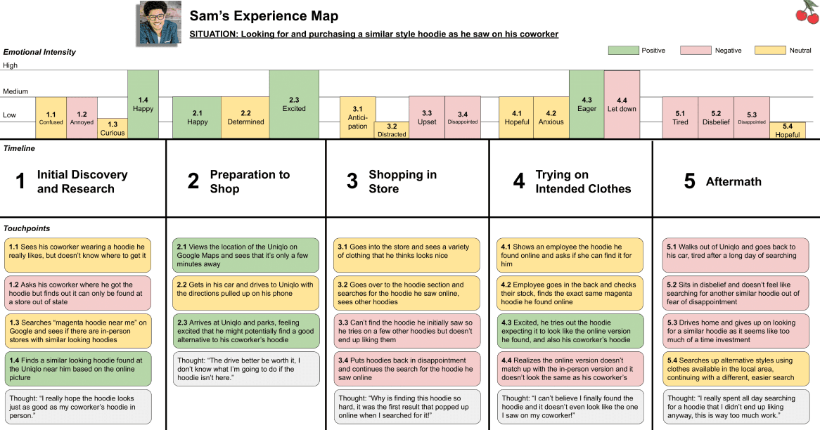
USER JOURNEY MAP:
Using our personas, we created a user journey map which detailed how one of our personas would interact with our application based on their background and preferences. Our user interviews informed our persona and our persona in turn informed our user journey. Detailed below is the user journey Sam (one of our personas) would go through from contemplating purchasing a duplicate version of a clothing item he saw to the purchase attempt. Detailed are also the emotions he would feel throughout the process, including their intensity levels.
DESIGN
Our design phase focused on the usability and use cases of our application. We aimed to support not only our established personas, but to also consider potential use cases on all extremes. By considering the facets of the design of our application, it helped us focus in on accessibility and inclusion while allowing us to more easily produce our proceeding prototype.
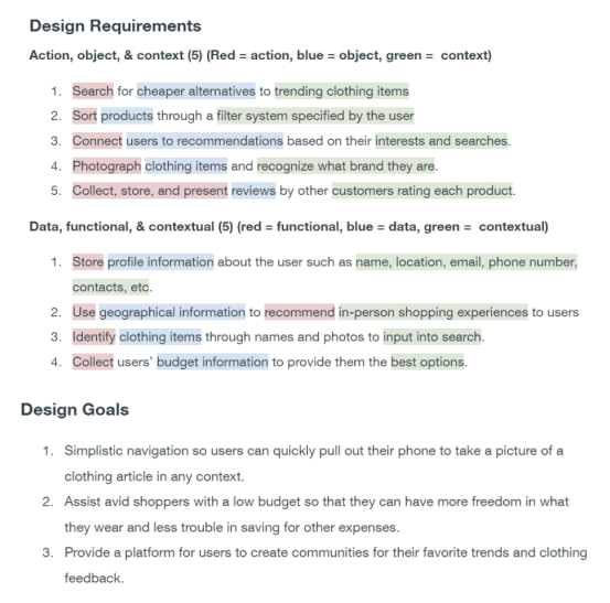
DESIGN REQUIREMENTS & GOALS:
Our design requirements and goals were based off our personas' use/tech, goals, pains, desires. By meeting these, we will have successfully satisfied these preferences to cater to our target user group. By making an application design that is inclusive and cognizant of their preferences, it works to serve rather than project our own biases. Our design requirements were split into two sections: (1) action, object & context (2) data, functional & contextual. Additionally, we had three design goals.
STORYBOARDS:
Our storyboards detail specific use cases for our application. These allowed us to test how users would encounter an issue and solve it using our application, and any use details in between. These storyboards also serve the purpose of acting as an overview of the general ability and use caveat of our application.
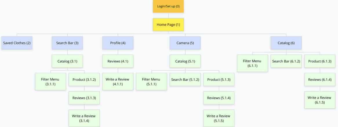
INFORMATION ARCHITECTURE:
In order for our users to be able to navigate through problems using our application as illustrated in our storyboards and to meet our design goals and requirements, detailing our information architecture was necessary. The information architecture details our application pathways and shows pages users are able to navigate from and to. This complete overview allowed us to easily transition into our lo-fi prototype, following this information architecture that meets our users' needs. Our information architecture found below, each box represents a page name with its nested location.
PROTOTYPE
Knowing our design goals and research findings, we were able to create a low fidelity prototype of our app on Figma. We also made annotated wireframes for every screen. We performed interviews with this prototype to test its usability and found many areas that could be improved. With this information, we created our high fidelity prototype, a mock up of our app Dupe Cherries.
LO-FI PROTOTYPE:
This low fidelity prototype allowed us to quickly get down our ideas for how our app's layout and design. We created 11 screens that consisted of all the features we wanted our app to provide and demonstrated the interactions, scenarios, and tasks we wanted our users to perform.
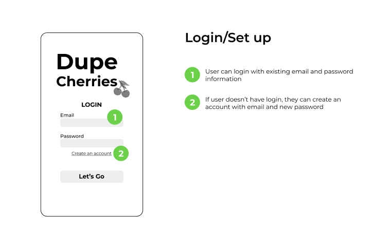
ANNOTATED WIREFRAMES:
Having made our low fidelity prototype, we then annotated each of the wireframes to show the reasoning behind our design decisions and explained the purpose of each feature and what it does. Here is a preview:
View the full annotated wireframes here.
EVALUATED FINDINGS:
Using our lo-fi prototype, each team member conducted an interview where each participant was asked to perform 3 different tasks on our app. Our motivation was to understand how different users interact with our application. These notes helped us improve the functionality of our designs to create the best experience possible for our users. Our method consisted of pre-test questions, task completion and observations, and a post-observation interview.
TASKS:
Take a picture of clothing item
Filter search options
Write a review for a product
FINDINGS:
Product page doesn’t give enough information about the product
Suggestion: Adding a product description sectionUnclear details about delivery time of products
Suggestion: Place delivery logistics on the product and filter componentsSearch filter options are too limited and constrains user control
Suggestion: Adding a custom price and distance user input box and increasing the price range
HI-FI PROTOTYPE:
Finally, using all the findings we've gathered, we created a high fidelity mock up of Dupe Cherries, a fully developed version of the app that demonstrates what it would look like for users in real life. We solidified our cherries theme with the red and green colors throughout the design. Our work throughout the entire quarter finally came together to produce a complete, professional, and aesthetic app!
REFLECTION
LESSONS LEARNED:
Although intensive, we learned an incredible amount about the design process through our project this quarter. In the research phase we learned that ensuring our biases don't affect the overall function and goal of the product is essential. This is why the research phase has so many parts. From user interviews to the user journey, knowing what our target users want allows for a product that serves that group instead of appealing directly to our biases.
We also learned during the design process that creating an inclusive and accessible product requires an incredible amount of planning. Writing out our requirements and goals and testing them out with our storyboards and information architecture allowed us to visualize the function of our product in different contexts.
The prototyping phase is where everything came together to produce a cohesive product. All our research and designing culminated into our low fidelity prototype, which represents the general form of our application and then going into the high fidelity prototype, which represents the function and visual of our final application.
FINALS THOUGHTS:
With this in mind, something we would do differently with more time allowance is interview a larger sample. By interviewing more people across more backgrounds, we would get a clearer grasp of what most of our target users want in the application rather than base it off of a few. This in turn would allow us to create more personas and journey maps to cross check our subsequent parts with.
Our biggest challenge was navigating and learning how to cooperate within the prevalent remote work culture. Deciding on communication norms and expectations is integral in such an environment. Although it was a hurdle at first figuring out meeting times and norms that worked with all members involved, we eventually got the hang of it and went on to smoothly cooperate on the Dupe Cherries application. How our team ended up working together was through constant communication and team-set deadlines. By keeping track of our progress as one rather than individually, it allowed us to go through the creative design process together.The most surprising and incredible part of the project was definitely how everything came together at the end. Every single part works to support the final project and every part was significant in its own way.
