Grounded Athletic Shoe
OBJECTIVE
To fill a hole in the footwear market and create a design prototype that answered the question: "How might we create a shoe that is both supportive and stylish?"
OVERVIEW
COURSE: HCDE 301: Advanced Communication in HCDE
TEAM: Gavin G., Fernando J., Anagha Y.
TIMELINE: 10 Weeks, Spring 2023
TOOLS: User Research (Survey, Interviews), Design (Sketching, Prototyping)
PROBLEM CONTEXT
Most shoes that are trendy and fashionable are typically uncomfortable for many users because of how narrow they are made. Every person is shaped differently and many shoe brands do not account for that, especially those with wider toes. This caused the widespread norm of the process of “breaking in shoes.” Your feet cannot be healthy if they are forced to squeeze into a shoe narrower than the ball of your feet. On the other hand, for companies that do offer inclusive options (like a wider toe box), their shoes tend to look less appealing and not fashionable. Why can’t we have both?
Grounded, an Athletic Shoe, is a one of a kind shoe that provides the comfortability you need while maintaining a stylish and versatile appearance. We at Grounded hope to continue evolving and pushing footwear forward by providing shoes that not only look good but are also made to work with, not against, the users foot.
PROCESS
RESEARCH
SECONDARY RESEARCH:
Insights:
You can get blisters from shoes being too loose or too tight, yet it’s impossible to find a shoe that perfectly fits your foot
Current shoes are narrow
To increase toe mobility, must make a wider toe box in shoe
Wider toe box gives balance
Should be able to wiggle toes in shoe
It is biologically better for humans to have their foot spread
Your feet cannot be healthy if squeezed into a shoe narrower than ball of feet
SURVEY:
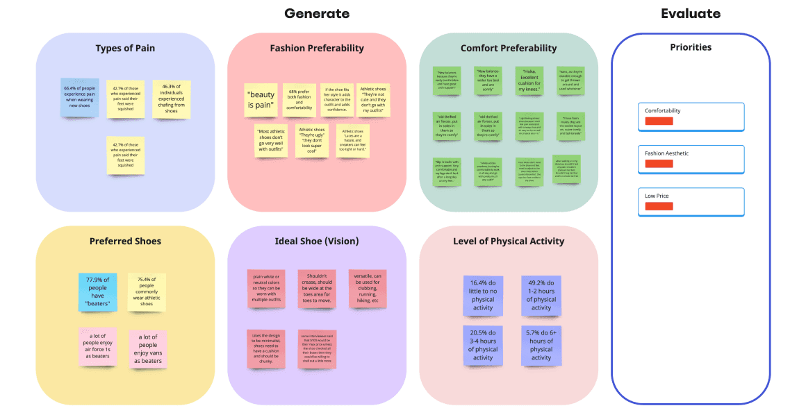
In our survey, we explored consumer priorities and challenges with footwear. We gathered data on age, gender, physical activity levels, and the types of activities people engage in. Participants were asked about their preference for comfort versus fashion, their use of athletic shoes, and whether they have "beaters" or everyday shoes. We also inquired about any discomfort or pain experienced with new shoes, including specific issues like squished toes, lack of arch support, and chafing. This feedback provided valuable insights into consumer preferences and needs in the footwear industry.
We managed to collect 122 responses on our survey and collected many key insights!
Fashion aesthetic more important than comfort
Minimal and classic design preferred
Versatility
Three major pain points for comfortability (percentages from survey):
Lack of arch support (39%)
Chafing (46.3%)
Squished toes (42.7%)
We developed those priorities by organizing our data points in a Miro board and grouping them into an Affinity diagram:
INTERVIEWS:
We conducted interviews to gather in-depth, personal insights on our problem statement: balancing fashion and comfort in shoes. Key areas of focus included:
How people experience and manage foot pain
Their expectations for shoe comfort and fashion
Features they value in current shoes
Interview questions covered topics such as:
Factors influencing shoe purchases
Spending habits and ideal shoe characteristics
Desired changes to favorite shoes
Brand preferences and associations
Definitions of comfort and fashion in shoes
Experiences with discomfort and use of insoles
Impact of shoe width on buying decisions
These interviews aimed to provide a deeper understanding of consumer needs and preferences beyond what our survey could reveal.
Findings:
I interviewed my roommate, C. I gained tons of valuable insights, that combined with my team members' findings, helped us come up with key recommendations for a new shoe:
A wider fit to reduce pressure and tightness around feet
Improved arch support
Classic and appealing design
Versatility
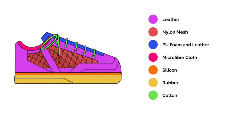
Improved materials to reduce chafing (i.e nylon microfiber)
DESIGN
IDEATION & SKETCHING:
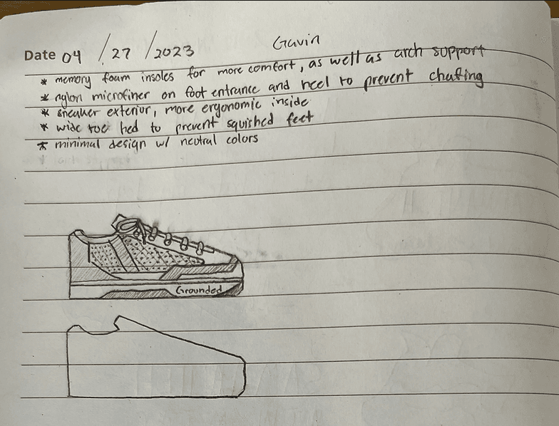
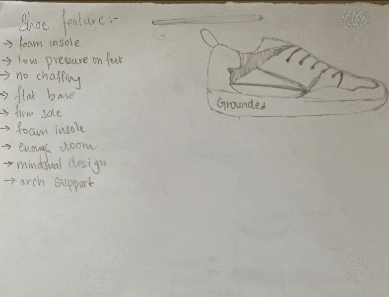
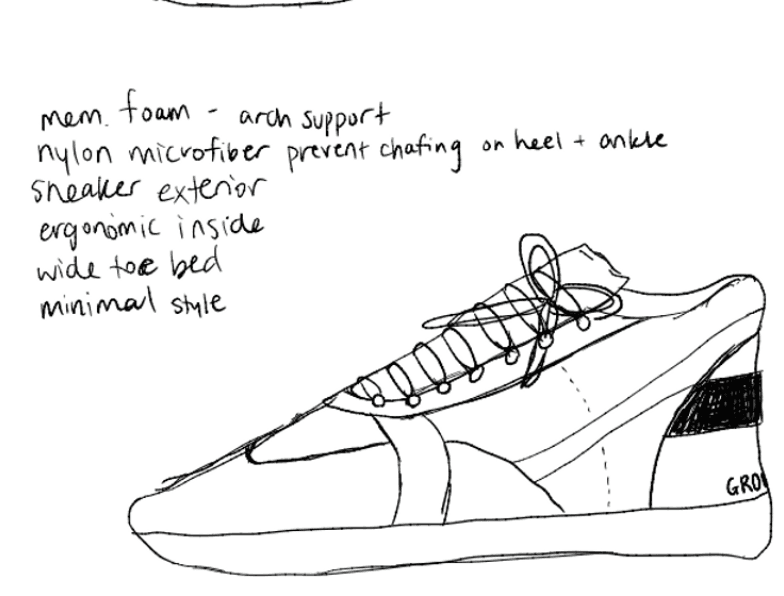
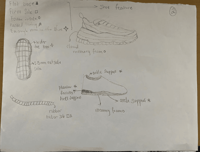
The next step involved sketching out several design ideas to serve as a foundation for further iteration and refinement. Each team member contributed two designs, totaling eight sketches. We incorporated quantitative data from our surveys to address the top three pain points—lack of arch support, chafing, and squished toes—in each design. Additionally, we integrated the qualitative feedback to maintain a minimal and classic aesthetic. Below are four of our most promising sketches.
DESIGN CHOICES & VOTING:
As a group, we’ve unanimously decided on what the structure of the shoe (specifically the inside) would look like because of what we’ve gathered in our data:
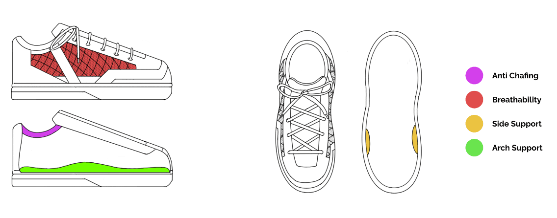
Memory foam insoles for increased comfort, as well as arch support
Nylon microfiber at the boot entrance and heel to prevent chafing
Wide toe bed to prevent squished toes
Sneaker exterior with a more ergonomic and versatile inside
Minimal design with neutral colors
Because of how specific that is, we can only go so far with the inside design and structure. Therefore, this meant that in our sketches–critiquing and voting–it all essentially comes down to the design of the outside of the shoe. We picked the one that we felt was least alike with current shoes on the market, as well as other factors like minimalism, flatness, and aesthetics, which were all things we were aiming for. We voted for Gavin's first design (top right above).
PROTOTYPE
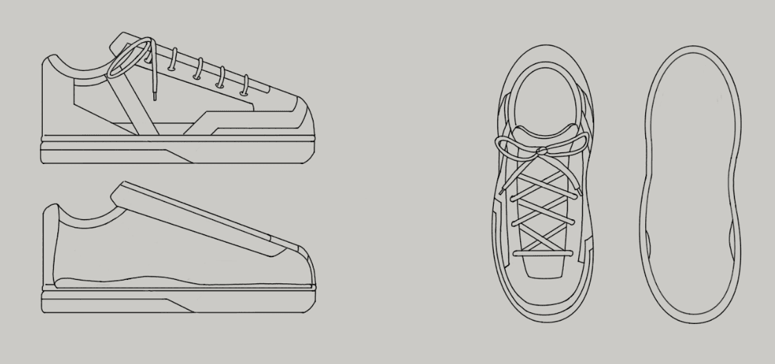
While we were excited with the idea of doing a physical product instead of an app/website design like others, it came with many challenges. With time constraints, we were unable to create an actual, physical prototype. Therefore, we had to settle with as detailed drawings as possible to present as a prototype.
INITIAL PROTOTYPE:
PROTOTYPE TESTING:
Our testing plan involved asking individuals for feedback through first impressions & test scenarios after hearing the overview of our product and viewing the design:
Would you wear this shoe to go with your everyday outfits?
Would you wear this shoe for physical activity (i.e. walking, etc)?
Secondary questions based off of previous answers
Learnings:
Overall positive response (we took it with a grain of salt considering the state of our prototype at the time)
Would wear our shoes for everyday purposes
Shoe looks like it’s spacious and adds comfort
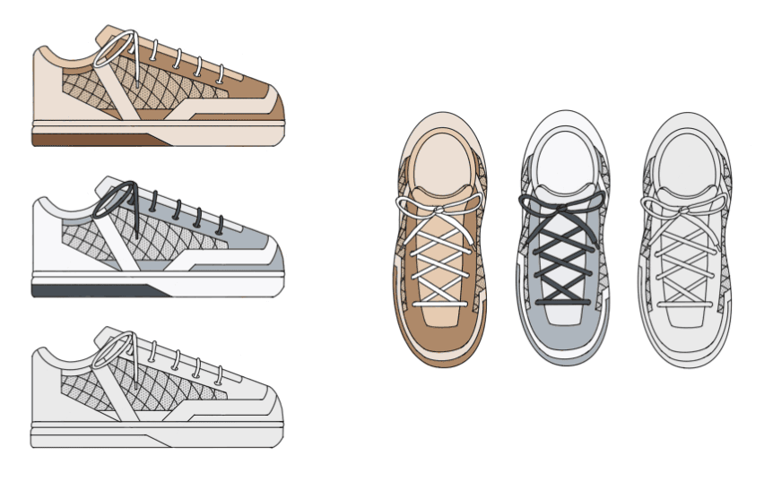
Color is a big factor in purchasing decision - neutrals!
Next iteration must include color
Feedback: include customizable features, different options for color and comfort (i.e. removable insoles)
FINAL PROTOTYPE:
Color Options
Details of Materials
Details of Features
REFLECTION
CHALLENGES:
While we were excited with the idea of doing a physical product instead of an app/website design like others, it came with many challenges. With time constraints, we were unable to create an actual, physical prototype. Therefore, our product at this time is not as advanced as our peer’s product designs. We had to settle with as detailed drawings as possible.
Another limitation with this physical product is that none of our team members had sufficient experience or knowledge about shoes. Our lack of mechanical understanding about shoes caused a lot of indecision for the first couple weeks, as we had a vague product idea that took us time to see what was possible before we finally narrowed it down. It also meant that we had to perform more extensive research about this industry. This slight doubt and uncertainty in our project idea was a challenge for us to get over, but with time we gained more confidence in our abilities. Our passion for the idea played a huge role in keeping us going.
FINALS THOUGHTS:
What we learned:
Making a shoe is hard. We shot for the stars!
The ins and outs of shoes, specifically sneakers.
How to get past collaboration obstacles when we couldn't decide on an idea - voting and compromising!
